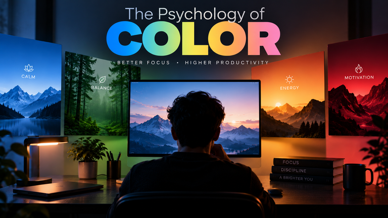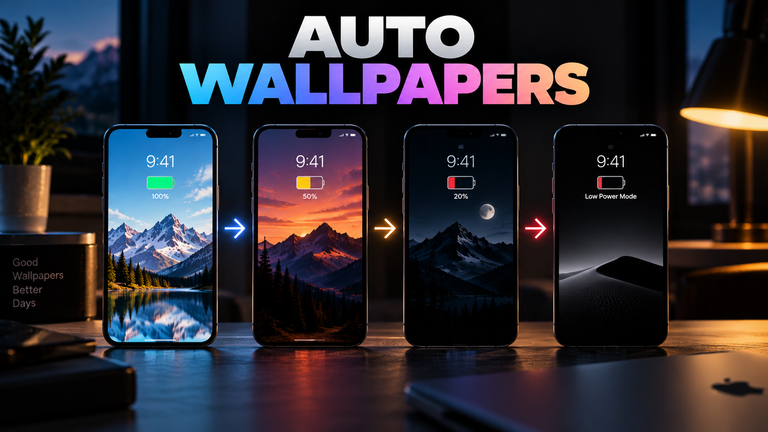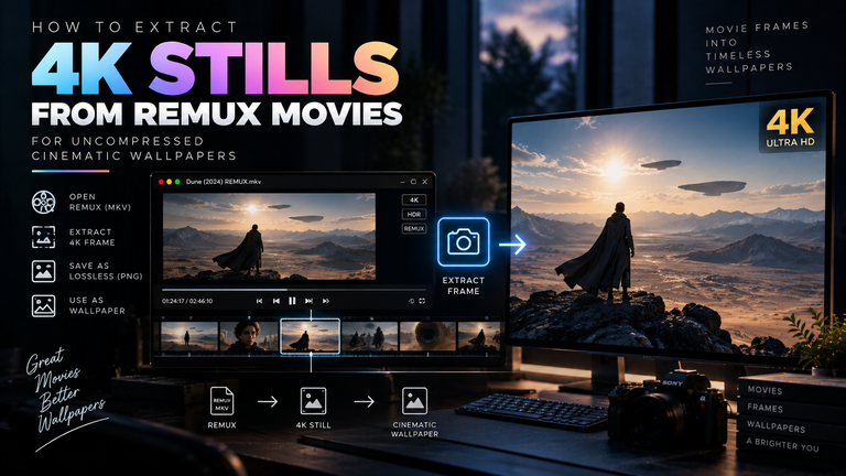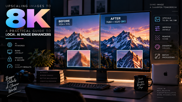

In an era where our smartphones are dominated by infinite scrolling feeds, notifications, and immersive apps, the home screen wallpaper might seem like an irrelevant relic of the past. Yet, data shows that users spend significant time and effort curating their device backgrounds. We still care about wallpapers because they serve as one of the few remaining digital spaces over which we have absolute control. In an otherwise chaotic digital environment, a carefully chosen wallpaper acts as a psychological anchor, actively reducing cognitive load, mitigating eye strain, and providing a necessary visual reset between tasks.
Table of Contents
- The Science of Visual Clutter and Cognitive Load
- Combating Screen Fatigue Through Design
- Reclaiming the Home Screen: Widgets vs. Apps
- The Psychological Reset
- Frequently Asked Questions (FAQ)
The Science of Visual Clutter and Cognitive Load
The human brain is biologically wired to favor simplicity and recognizable patterns. When you unlock a smartphone to a chaotic, high-contrast, or overly complex background covered in app icons, you are instantly subjecting your brain to “visual noise.”
Cognitive load refers to the amount of working memory your brain is utilizing at any given moment. A cluttered digital interface forces the visual cortex to actively filter out the background just to identify the app you want to open. While this calculation takes mere milliseconds, doing it a hundred times a day creates measurable mental friction. By prioritizing minimalist wallpapers with ample negative space (or “white space”), you reduce the extraneous cognitive load. This is a deliberate method of taking back control of your digital environment, stripping away the friction of daily smartphone use and allowing for sharper task efficiency.
Combating Screen Fatigue Through Design
Beyond the mental toll, poor wallpaper choices actively contribute to physical ocular fatigue—often diagnosed as Computer Vision Syndrome.
When you use an app like Instagram or X (formerly Twitter), your screen is likely emitting a significant amount of white light. If your wallpaper is equally bright or heavily saturated with neon colors, you are sustaining that high light output. More importantly, if your wallpaper is filled with sharp, high-contrast geometric patterns, your eye muscles are forced into rapid micro-adjustments every time you return to the home screen. Over the course of a day, these adjustments lead to eye strain, dryness, and tension headaches.
This highlights exactly how calming visuals combat screen fatigue. By selecting wallpapers with muted tones, dark earthy palettes, or soft gradients, you artificially lower the average light output of the display. This allows your visual system to momentarily relax before diving into the next bright, text-heavy application.
Reclaiming the Home Screen: Widgets vs. Apps
The way we interact with our devices has fundamentally shifted in the last few years. Historically, the home screen was just a grid of icons, and the wallpaper was barely visible behind them. Today, the introduction of massive, interactive widgets on both iOS and Android has fundamentally changed the real estate of our devices.
Users are intentionally hiding their app grids in the App Library or App Drawer, preferring to leave entire pages of their home screen completely empty, save for a clock or a weather widget. This shift in user interface design has thrust the wallpaper back into the spotlight. It is no longer a background element; it is the primary visual interface of the modern smartphone. Because the wallpaper is now highly visible, its quality, resolution, and aesthetic impact are more important than ever before.
The Psychological Reset
Digital devices are inherently associated with stress, work emails, endless news cycles, and social media anxiety. A wallpaper serves as a psychological buffer against this stress. Research into environmental psychology suggests that viewing nature-based imagery—even on a digital screen—can trigger a parasympathetic nervous system response, slightly lowering heart rate and cortisol levels.
When you close out of a stressful work email and are greeted by a high-resolution, serene forest landscape, you are experiencing a micro-break. It is a moment of digital escapism. This is why our Nature Wallpapers collection remains consistently popular; users intuitively understand that they need a visual palate cleanser to break up the monotony of the digital grind.
Frequently Asked Questions (FAQ)
Can a wallpaper really improve my productivity?
Yes. By reducing visual clutter and utilizing dark or muted colors, you minimize the cognitive friction required to navigate your phone. A clean home screen prevents accidental app launches and reduces the time spent searching for tools, directly increasing task efficiency.
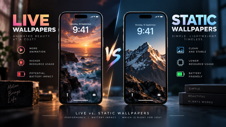
Are moving or live wallpapers bad for focus?
They can be. While aesthetically pleasing, constant motion in your peripheral vision triggers human evolutionary responses designed to detect threats. A looping animation can draw your attention away from the app you intended to open, subtly increasing the likelihood of digital distraction.
What color wallpaper is best for eye strain?
Ophthalmologists generally recommend warm, dark tones. Deep blues, forest greens, and dark greys are ideal. These colors emit less harsh blue light and require less luminance from the display panel, significantly reducing the strain on your retinas during nighttime use.