
The background on your phone or desktop monitor is more than just a decorative choice; it is a persistent visual stimulus that you subconsciously process thousands of times a day. Environmental psychology dictates that the colors surrounding us have a measurable impact on our nervous system, heart rate, and cognitive performance. By understanding the science of color temperature and visual processing, you can intentionally curate your digital workspace to lower stress, reduce eye strain, and significantly boost your daily productivity.
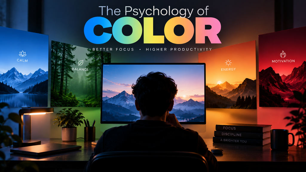
Table of Contents
- The Cognitive Impact of Specific Colors
- Blue Light, Circadian Rhythm, and Sleep
- Contrast and the Real Cause of Screen Fatigue
- Optimizing Your Digital Workspace
- Frequently Asked Questions (FAQ)
The Cognitive Impact of Specific Colors
Different wavelengths of light trigger different neurological responses in the brain. When choosing a wallpaper for a work device, you must align the dominant color profile with your productivity goals.
- Blue (Focus and Logic): Blue is widely recognized as the most effective color for intellectual work. It promotes a sense of calm, lowers the heart rate, and helps maintain sustained concentration during analytical tasks. A deep navy or slate blue background is ideal for programming or writing.
- Green (Balance and Rest): Green sits at the center of the visual spectrum, making it the easiest color for the human eye to process. It requires no adjustment, making it excellent for reducing eye strain during marathon work sessions. Nature-based green wallpapers provide a restorative effect when you glance away from active windows.
- Red and Orange (Energy and Urgency): Warm, vibrant colors stimulate the nervous system, increasing energy and alertness. However, they also induce a subtle sense of stress and urgency. While great for a gym playlist background, a bright red wallpaper will quickly cause cognitive exhaustion in a work environment.
- Sterile Neutrals (Boredom): While reducing visual clutter to decrease cognitive load is important, choosing a completely blank white or flat gray wallpaper can lead to “visual deprivation.” Your brain thrives on mild stimulation; too much sterility can actually induce lethargy and boredom.
Blue Light, Circadian Rhythm, and Sleep
While blue is excellent for focus, it comes with a biological caveat. Displays emit High-Energy Visible (HEV) blue light, which directly affects your circadian rhythm—the internal biological clock that dictates your sleep-wake cycle.
During the morning and afternoon, exposure to blue-tinted light is beneficial. It suppresses the production of melatonin (the sleep hormone), keeping you alert and sharp. However, if you maintain a cool-toned, blue-heavy wallpaper late into the evening, your brain receives the signal that the sun is still up. This disruption in melatonin production leads to poor sleep architecture, which directly sabotages your focus and productivity the following day.
This is precisely how color temperature affects circadian rhythms and why switching to warmer, darker tones (like deep oranges, browns, or true blacks) after sunset is critical for digital health.
Contrast and the Real Cause of Screen Fatigue
Many users blame “blue light” for their headaches, but the primary culprit of digital eye strain (Computer Vision Syndrome) is usually extreme contrast and visual effort.
If you are working in a dimly lit room with a bright, high-key wallpaper, your pupils are constantly forced to constrict and dilate as you switch between the bright desktop and the dark ambient environment. Furthermore, staring at a highly detailed, chaotic background forces the ciliary muscles in your eyes to constantly seek focus. Selecting a wallpaper with muted tones, soft gradients, and low contrast minimizes this muscular effort, keeping your eyes relaxed.
Optimizing Your Digital Workspace
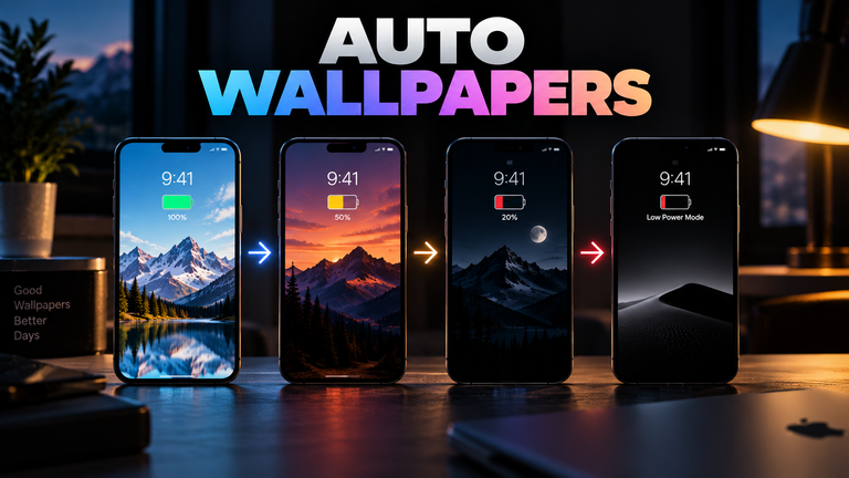
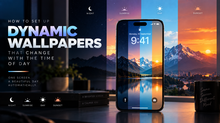
To build the ultimate productivity setup, your wallpaper should be dynamic. Utilize a cool, bright, and perhaps slightly saturated background (like a morning mountain landscape) to kickstart your brain during the first half of the day. As the afternoon progresses, rely on OS-level automations or third-party software to transition your background into muted, warm tones (like a twilight desert or a deep, minimalist abstract design) to begin easing your nervous system into a state of rest.
If you want to explore backgrounds specifically curated for concentration and low eye-strain, browse our Minimalist Wallpapers collection, where every image is vetted for optimal contrast and cognitive balance.
Frequently Asked Questions (FAQ)
Do blue light filter glasses actually improve productivity?
The scientific consensus is mixed. While they do block HEV light (which helps preserve your circadian rhythm if used at night), they do not prevent digital eye strain. Eye strain is caused by reduced blink rates and focusing fatigue, neither of which are solved by wearing tinted lenses. A properly dimmed, low-contrast wallpaper is often more effective.
What is the 20-20-20 rule?
It is an ergonomic practice recommended by optometrists to combat screen fatigue. Every 20 minutes, you should look away from your screen and focus on an object at least 20 feet away for a minimum of 20 seconds. This allows the focusing muscles in your eyes to completely relax.
Does True Black (OLED) background reduce eye strain?
Yes. On an OLED monitor or smartphone, true black pixels are turned off, meaning they emit zero light. This drastically reduces the overall luminance of the display, resulting in significantly less photic stress on your retinas in dark environments.